Although some Yapla modules can display data from the Data and Events applications (for Conference types), it is possible to create a template from scratch to display this data on your Yapla Website. There are many possible examples: the schedule for your conference, the speakers at your conference, a list of job offers, a list of individuals or resources, etc.
In this article for website developers, you'll learn the steps you need to take to create your first templates.
Prerequisites
To access Yapla template creation, you must have the Premium plan and a Yapla website. You must also have created an object in the Data application. The objects you wish to retrieve must have public visibility.

Create a template
Templates can be created from your website's Views and templates tile in the Website application, then from the Templates tab.
Template types
- Standalone template: To create a template from scratch, not linked to a Yapla module.
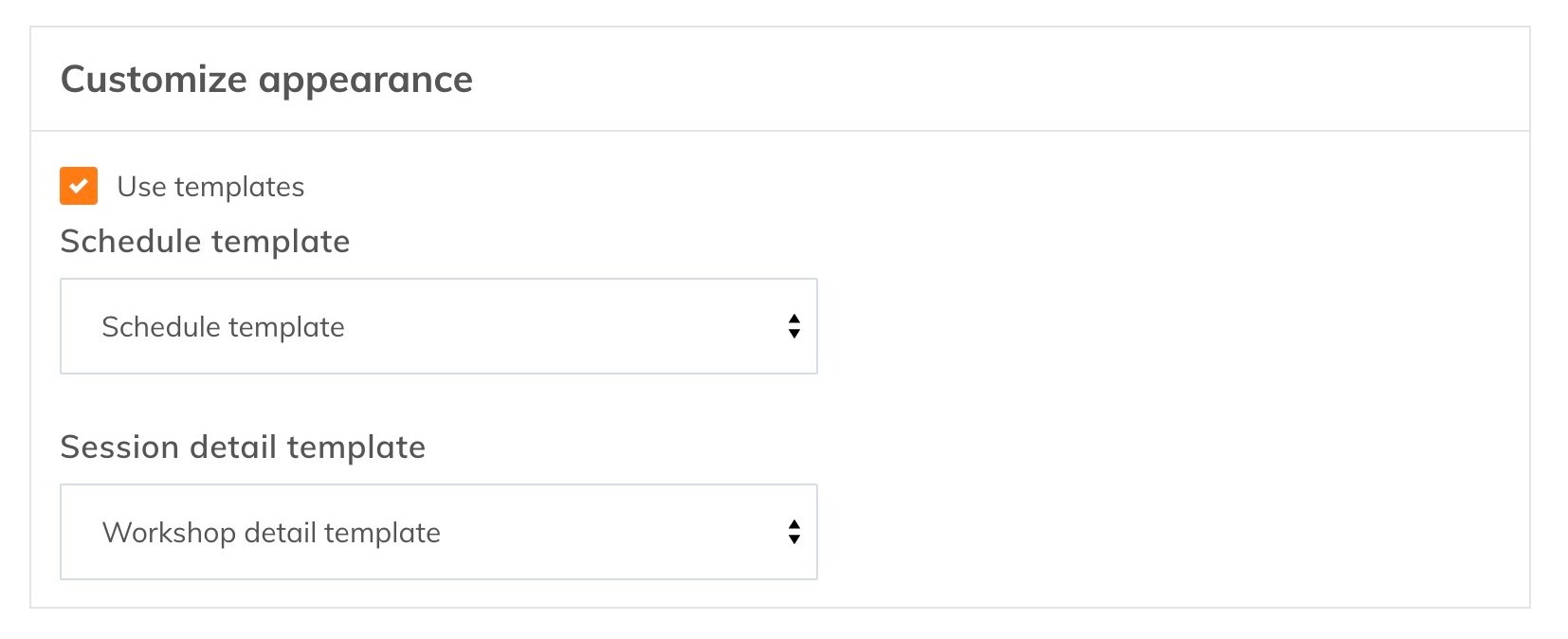
- Yapla Module Template: Customize the appearance and applications of an existing Yapla module. Some modules may have several templates for their different interfaces.

All templates offer the same possibilities: a template using the Vue JS rendering engine, CSS and a GraphQL query to retrieve information from Data. The query and CSS are optional, and will only be loaded when the template is used on a page.
Module templates are pre-populated by default with the module's base code for easy customization.
Displaying a template
To display a template, use the module corresponding to the type of template you have chosen. In the case of a customized template for the "Event Programming" website module, for example, select the template in the module settings.
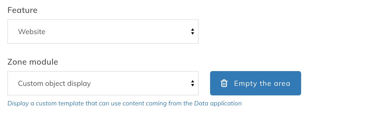
For a stand-alone template, use the "Custom display of objects" module.
Retrieving information from Data
LTemplates can access object entries in Data using a GraphQL API generated from your organization's public objects. A static schema is generated and can be consulted using third-party software (such as Postman, for example) at the following address: https://votresite.com/fr/graphql.
It is with this API that the template can interact to retrieve your data. In the "Query" tab of the model is the GraphQL editor, which comes with a syntax analysis of your query and offers intelligent auto-completion based on your organization's schema.
Example of a Yapla Objects schema
type Query {
  allCharacterEntries(
    after: String
    first: Int
    before: String
    last: Int
  ): characterEntryConnection
  allEpisodeEntries(
    after: String
    first: Int
    before: String
    last: Int
  ): episodeEntryConnection
}

"A connection to a list of items."
type characterEntryConnection {
  "Information to aid in pagination."
  pageInfo: PageInfo!

  "Information to aid in pagination"
  edges: [characterEntryEdge]
}

"Information about pagination in a connection."
type PageInfo {
  "When paginating forwards, are there more items?"
  hasNextPage: Boolean!

  "When paginating backwards, are there more items?"
  hasPreviousPage: Boolean!

  "When paginating backwards, the cursor to continue."
  startCursor: String

  "When paginating forwards, the cursor to continue."
  endCursor: String
}

"An edge in a connection"
type characterEntryEdge {
  "The item at the end of the edge"
  node: characterEntry

  "A cursor for use in pagination"
  cursor: String!
}

type characterEntry {
  identifiant: Float
  status: String
  name: String
  appears_in(
    after: String
    first: Int
    before: String
    last: Int
  ): episodeEntryConnection
}

"A connection to a list of items."
type episodeEntryConnection {
  "Information to aid in pagination."
  pageInfo: PageInfo!

  "Information to aid in pagination"
  edges: [episodeEntryEdge]
}

"An edge in a connection"
type episodeEntryEdge {
  "The item at the end of the edge"
  node: episodeEntry

  "A cursor for use in pagination"
  cursor: String!
}

type episodeEntry {
  identifiant: Float
  status: String
  name: String
  characters(
    after: String
    first: Int
    before: String
    last: Int
  ): characterEntryConnection
}
Example of a query
query {
  episodes: allEpisodeEntries {
    edges {
      node {
        name
        characters {
          edges {
            node {
              name
            }
          }
        }
      }
      cursor
    }
  }
}
The component
The <Query> component executes the query and retrieves the result returned by the server. The result is returned in the component's slot props. Continuing the example above, to display the list of episodes we'd use the following code:
  <query< span="">
   v-slot=
   "{ queryData }"
   >
Épisodes
    <div< span="">
     class=
     "episodes"
     >

      <div< span="">
       v-for=
       "(episodes, i) in queryData?.episodes.edges"
       :key=
       "i"
       class=
       "episode"
       >
        <div< span="">
         class=
         "characters"
         >
Personnages de l'épisode
          <div< span="">
           v-for=
           "(character, y) in episode.node.characters.edges"
           :key=
           "y"
           class=
           "character"
           >
          </div<>
        </div<>
      </div<>
    </div<>
  </query<>
Pagination
The API generated by Yapla offers pagination with cursor. By combining server returns with the <Query> component we can set up two types of pagination:
- An infinite list
- Non-numbered bidirectional pagination
Infinite list
To set up an infinite list pagination, we can use the following variables:
- pageInfo.hasNextPage to determine whether the end of the results has been reached
- pageInfo.endCursor to define the starting point of the next segment of results.
We'll also need to use the <Query> component's fetchNext function and add pagination settings to the GraphQL query. All this in a simple example:
query ($first: Int, $after: String) {
  episodes: allEpisodeEntries(first: $first, after: $after) {
    edges {
      node {
        name
      }
      pageInfo {
        hasNextPage
        endCursor
      }
      cursor
    }
  }
}
Paged query
  <query< span="">
   :first=
   "5"
   v-slot=
   "{ queryData, aggregatedData, isLoading, fetchNext }"
   >
Épisodes
    <div< span="">
     class=
     "episodes"
     >

      <div< span="">
       v-for=
       "(episodes, i) in aggregatedData?.episodes.edges"
       :key=
       "i"
       class=
       "episode"
       >
        <button< span="">
         v-if=
         "queryData?.episodes?.pageInfo?.hasNextPage"
         :loading=
         "isLoading"
         @
         click=
         "fetchNext(5, queryData.episodes.pageInfo.endCursor)"
         > Charger plus d'épisodes


        </button<>
      </div<>
    </div<>
  </query<>
In this example we paginate the episodes 5 by 5 and use the variable aggregatedData to combine the new results with the old ones and obtain the effect of an infinite list.
Bidirectional
For bidirectional pagination, the method is very similar, but we add the other direction, i.e. the following variables:
- pageInfo.hasPreviousPage
- pageInfo.startCursor
- fetchPrevious in the component
Here's a simple example of an episode-by-episode display:
query ($first: Int, $after: String, $last: Int, $before: String) {
  episodes: allEpisodeEntries(
    first: $first
    last: $last
    after: $after
    before: $before
  ) {
    edges {
      node {
        name
      }
      pageInfo {
        hasPreviousPage
        hasNextPage
        endCursor
        startCursor
      }
      cursor
    }
  }
}
Note: The names of query variables are very important and must not differ from the examples so that the <Query> component can populate them with the correct information.
  <query< span="">
   :first=
   "1"
   v-slot=
   "{ queryData, isLoading, fetchNext, fetchPrevious }"
   >
Épisode
    <div< span="">
     class=
     "episode"
     >

      <p< span="">
       v-if=
       "queryData?.episodes.edges.length > 0"
       >
        <button< span="">
         v-if=
         "queryData?.episodes?.pageInfo?.hasNextPage"
         :loading=
         "isLoading"
         @
         click=
         "fetchNext(1, queryData.episodes.pageInfo.endCursor)"
         > Episode suivant


          <button< span="">
           v-if=
           "queryData?.episodes?.pageInfo?.hasPreviousPage"
           :loading=
           "isLoading"
           @
           click=
           "fetchPrevious(1, queryData.episodes.pageInfo.startCursor)"
           > Episode précédent


          </button<>
        </button<>
      </p<>
    </div<>
  </query<>
Combining Data content with a Module template
It's also possible to use the <Query> component and your site's GraphQL API in Yapla module templates. You can also condition the component call according to one of the module settings. For example, to display additional resources in the workshop details according to the workshop category.
  <div< span="">
   class=
   "workshop-detail"
   >

    <query< span="">
     v-slot=
     "{queryData}"
     v-if=
     "workshop?.tags.find(t => t.name === 'Ressources')"
     >

      <div< span="">
       class=
       "resources-link"
       >

        <p< span="">
         v-for=
         "(resource, i) in queryData?.resources.edges"
         :key=
         "i"
         >
        </p<>
      </div<>
    </query<>
  </div<>
References
The component for executing the template query and returning the result.
Settings
- first: number: The number of results to return, starting from the beginning. Used in the query to paginate the results.
- last: number: The number of results to return, starting from the end. Used in the query to paginate results.
Variables
Accessible from the slot scope.
- queryData: Object : Contains the results of the last GraphQL query, formatted according to the schema specified in the Query tab.
- aggregatedData : Object : Contains the combined results of all GraphQL queries (edges variables are combined together). Used to set up an infinite list pagination.
- isLoading: boolean : Reflects the loading status of the current query.
Methods
- fetchNext(size: number, cursor: string) : Retrieves the number of results specified after the cursor.
- fetchPrevious(size: number, cursor: string) : Retrieves the number of results specified before the cursor.
Yapla utility component for buttons using your site's design.
Settings
- type?: string<'primary'|'secondary'> : Sets the button style as primary or secondary. Default: 'primary'
- disabled?: boolean : Disables the button Default: false
- loading?: boolean : Displays a loading status on the button and deactivates it Default: false
Événements
- @click: Appelé lorsque le bouton est cliqué